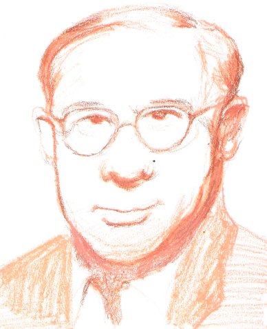

This top picture is the latest experiment with oil pastels. I quite like it, but I really had to produce some horrid stuff to get there. I don’t understand why I’m drawn to oil pastels: they’re messy, smeary, thick, and generally hard to use. I like the vibrancy of the colours and the transparent effect of the smeariness which I am beginning to harness.
These are the first experiments with oil pastels I did last year some time with some old pastels I found. When I came across them again I found them intriguing rather than just a mess, as I had dismissed them, but it took a lot more experimenting to identify that the interesting effect was obtained by using one colour on top of another.


These are the two little doodles I did to experiment with the smear effect.
The squares were to see what would happen systematically if you run different colours into each other, (one of the squares is done with felt-tip). In the other one, I noticed that even if you draw a line and then run over it with the same colour you get an interesting smeary effect.
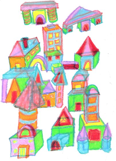
 The cathedral-type drawing was an exercise in how not to exploit the properties of oil-pastels. The only interesting thing about this drawing is the colours; I particularly like the vibrancy of the towers. This was before discovering the miracle of smeariness
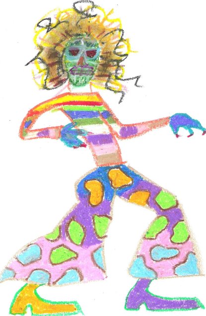
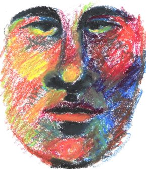
The two drawings at the bottom, the face and the mad figure, were when I was discovering what happened when you superimposed different colours on one another. They’re pretty hideous, aren’t they, but, you know, “defer judgement.”

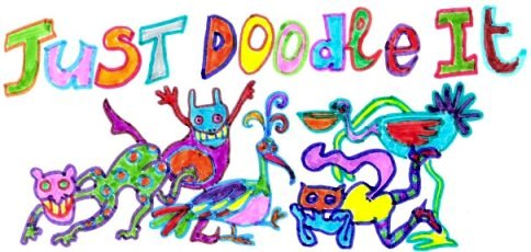
 These are two of the ugliest doodles I have produced so far. The one with the little monsters (below left) is a type of doodle I do when I can’t think of what else to do, which consists of scribbling on the paper and then drawing whatever images emerge from the scribble. The kind of cowboy picture was born of a doodle I did last year, where I was experimenting with picture frames, trying to embed picture frames within each other. The effect was quite interesting, and I intend to play with it again.