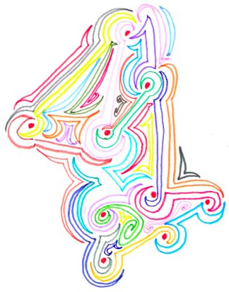
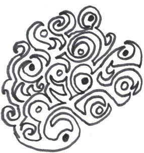
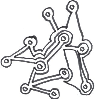
These are two doodles just based on a swirly line that became a kind of jungle theme.


These are two doodles just based on a swirly line that became a kind of jungle theme.
Posted in forced association
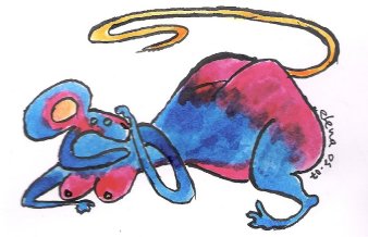
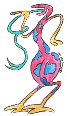
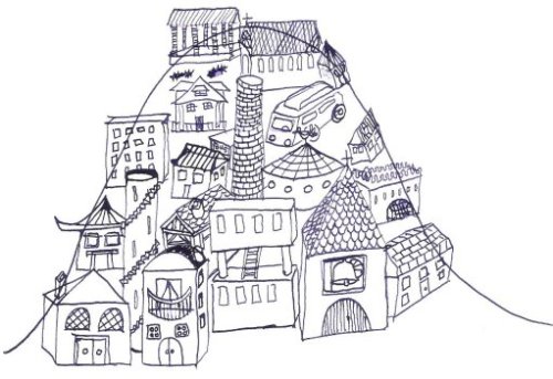
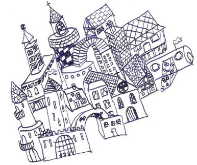
Sometimes I can do good doodles by scribbling in pencil all over the page, then staring at it for a bit, until I see some figures emerge, then I draw the things I see emerging from the mess, and then I colour them in ink to make them look pretty. Here are a couple of them.


Posted in forced association

This top picture is the latest experiment with oil pastels. I quite like it, but I really had to produce some horrid stuff to get there. I don’t understand why I’m drawn to oil pastels: they’re messy, smeary, thick, and generally hard to use. I like the vibrancy of the colours and the transparent effect of the smeariness which I am beginning to harness.
These are the first experiments with oil pastels I did last year some time with some old pastels I found. When I came across them again I found them intriguing rather than just a mess, as I had dismissed them, but it took a lot more experimenting to identify that the interesting effect was obtained by using one colour on top of another.

These are the two little doodles I did to experiment with the smear effect.
The squares were to see what would happen systematically if you run different colours into each other, (one of the squares is done with felt-tip). In the other one, I noticed that even if you draw a line and then run over it with the same colour you get an interesting smeary effect.
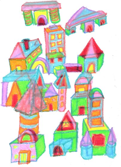
 The cathedral-type drawing was an exercise in how not to exploit the properties of oil-pastels. The only interesting thing about this drawing is the colours; I particularly like the vibrancy of the towers. This was before discovering the miracle of smeariness
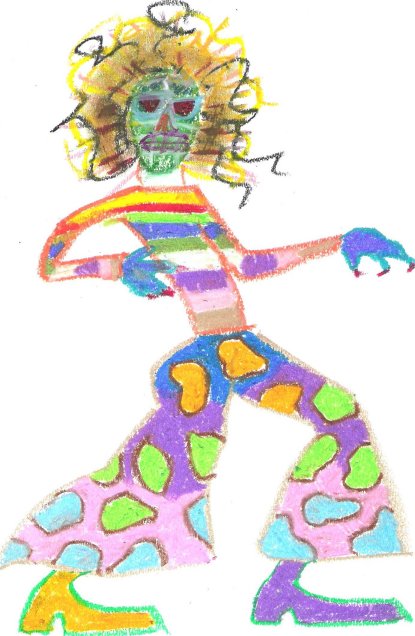
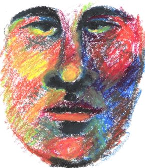
The two drawings at the bottom, the face and the mad figure, were when I was discovering what happened when you superimposed different colours on one another. They’re pretty hideous, aren’t they, but, you know, “defer judgement.”

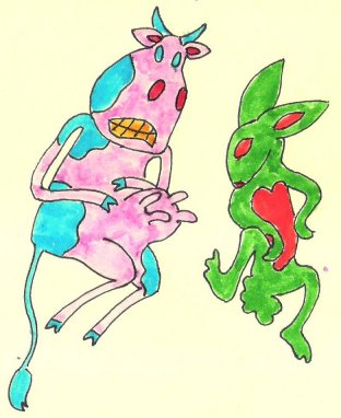
 These are two of the ugliest doodles I have produced so far. The one with the little monsters (below left) is a type of doodle I do when I can’t think of what else to do, which consists of scribbling on the paper and then drawing whatever images emerge from the scribble. The kind of cowboy picture was born of a doodle I did last year, where I was experimenting with picture frames, trying to embed picture frames within each other. The effect was quite interesting, and I intend to play with it again.
Posted in architecture, oil pastels
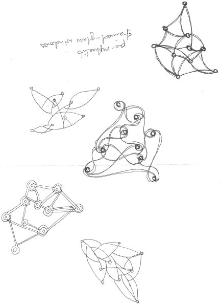
These doodles are inspired by Bruno Munari’s book, “Flight of Fancy”, which consists of the same random scattering of dots on every page which have been joined together in different ways. I have bought this book twice and given them away as presents to children I love, so, regrettably, I don’t have my own copy at the moment. Must get one.
 I did this while at work, last September, supervising a workshop. It was during an activity that I felt was proceeding just fine without my control-freakish attentions, so I found myself in a perfect frame of mind to doodle: half of my attention devoted to looking like I was paying attention, and the rest to exploring and messing around with pen and paper. I was pleased with the result. The only problem is that it really is impossible to doodle unnoticed. It’s not quite as socially unacceptable as yawning conspicuously, but you just don’t look anything like someone who’s paying attention to what’s going on around them. Although I was drawing in the same notebook that I was taking notes of the event in, it was obvious I wasn’t writing: I was clearly doing something much more absorbing, so much so that people kept wandering over to see what I was scribbling. Since I was being paid quite a lot of money to pay attention to what was going on, I decided this activity might provoke some hostility – and, heaven knows, consultants don’t actively need to look for opportunities to provoke hostility – so I’ve stopped trying to meet my doodle quota while I’m working. However, I am interested in re-creating that happy state of devoting half a mind to something that’s going on externally, which seems to free up the doodling-inclined part of my brain to draw, unhindered and uninhibited by the usual white noise of discouraging voices in my head telling me I’m doing it wrong, it’s ugly, it’s boring, etc. I’ve discovered I can re-create this state by watching TV or a movie. However, I can get so absorbed in the drawing that I miss most of what I’m watching, so, ideally it needs to be something not very challenging and very predictable: CSI is perfect, for example. I’ve also done some good doodles during Toastmasters meetings as well…
I hope I’m going to be able to do this. Even doodling takes time, and I seem to need to warm up to be able to just doodle – and I thought that’s what doodling was: the equivalent of piano scales before you get down to the business of playing music. Darn it. I did these with a dip pen, which is scratchy and wobbles but seems to be the tool of choice of “real” cartoonists, so I am determined to make friends with it.
Here’s some cross-hatching.

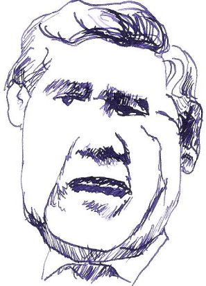
Here’s Gordon Brown.
Here are two doodles trying to prove that perspective isn’t important.
I hereby resolve that for at least the month of January, I will doodle every day, however rubbish what I draw is; I will suspend judgement, go for quantity rather than quality, experiment with different media, try new things. I will post as often as I can.
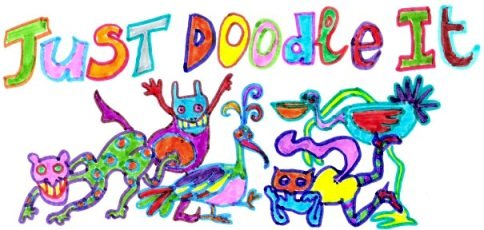
This was the alternative banner for this blog. Unfortunatly it looks crap scanned, and it’s also the wrong size. I don’t understand why the colours look so faded. The paper version is much prettier.
I bought some oil pastels over Christmas and yesterday I played with them for the first time. I think the result looks a bit like a child’s crayon drawing. I never liked crayons, they were too messy and not bright enough. Mind you, I didn’t like colour when I was little. I wasn’t good at colouring in because I was too much of a perfectionist to enjoy it.
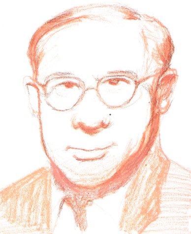
I was quite pleased with this portrait copied from a photo cut out from a newspaper obituary, drawn freehand with a light brown pastel and then with a bit of dark brown for extra emphasis. Not because it looks particularly like the original, but because it looks vaguely life-like.
| stefan on Animal jigsaw | |
| Chris Foulkes on Inspired by Jackson Pollo… | |
| Chris Foulkes on Scribble art |